How to make every Spotify playlist more exciting
A quick article about how to create great Spotify covers for yourself and elevate your playlists.

This article is targeting people who like to listen to their own playlists with Spotify. I want to show you a way how to spice up your Spotify playlists, so that their perceived value increases.
It's up to you, if you want to share your private playlists with everyone. But if they are set as public and if other people find them, they might think that the playlists are made by someone professional.
If you want to achieve this as well, the simplest task you need to do is to add custom-made cover-images to your playlists.
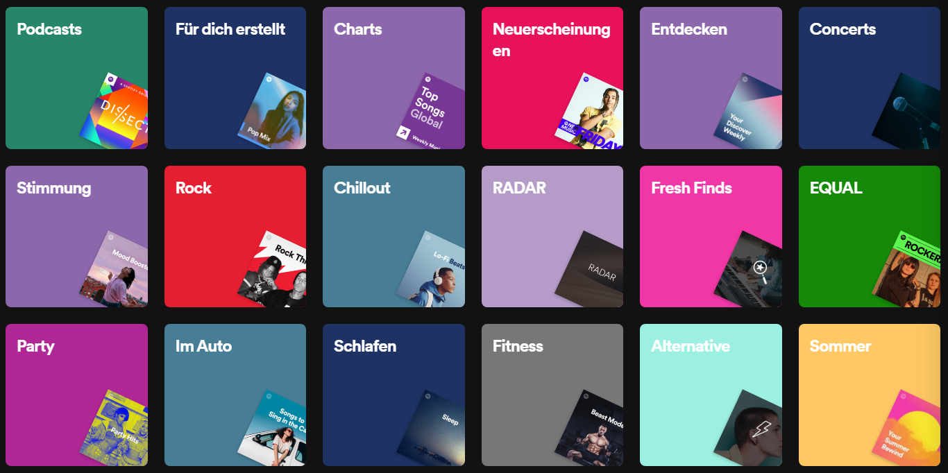
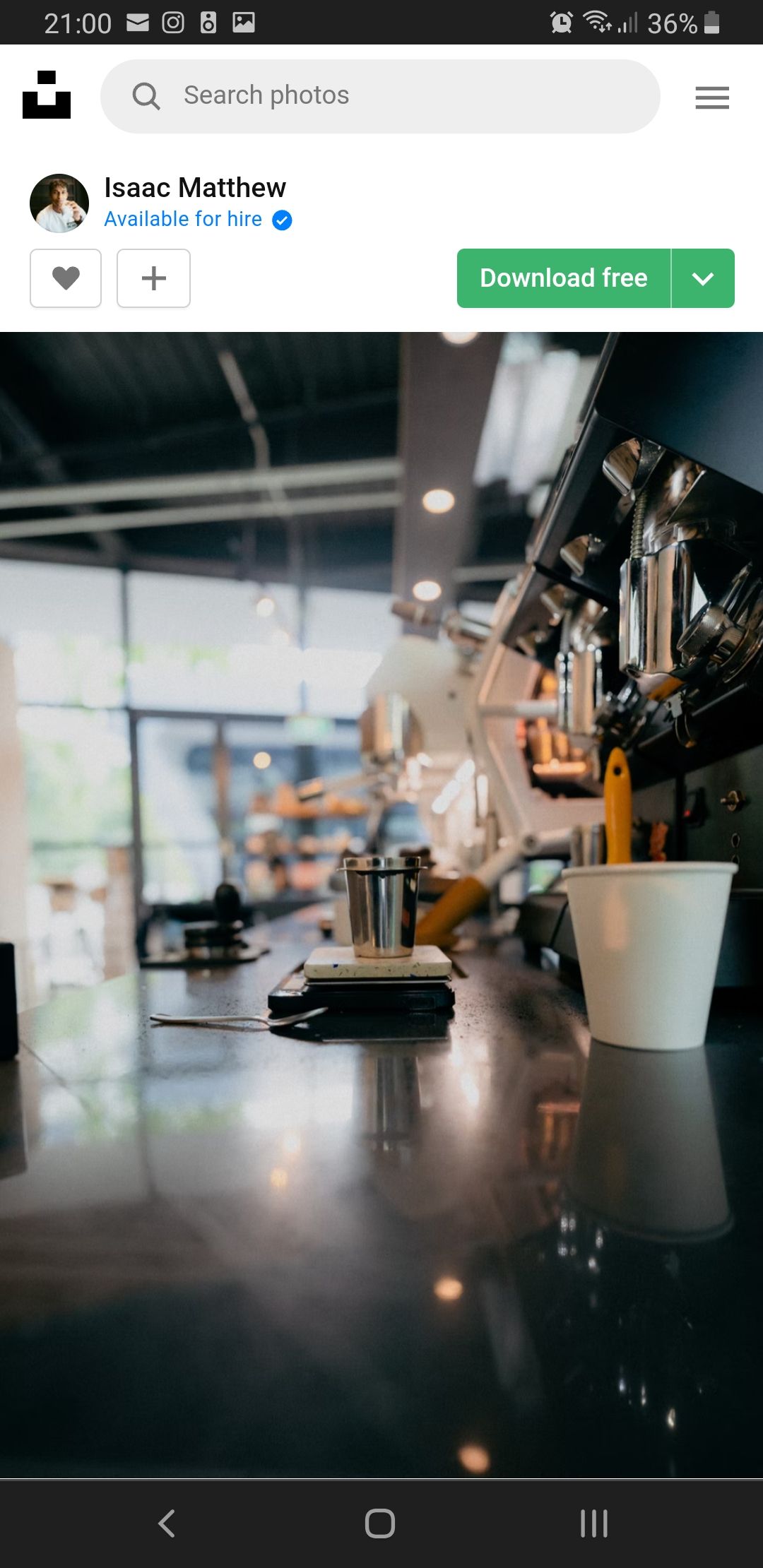
Right now, most of your playlists probably have the standard Spotify cover comprising the album covers of the first four songs of your playlist (just like this one).
If you use a playlist for over a year, the probability is high that you barely listen to the songs displayed on the cover. Instead, you listen to the newest songs added to your playlists. This makes the playlist look somehow unattractive, even though you listen to your playlist regularly.
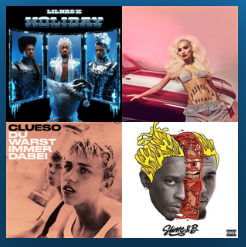
To show you how a cover could look like, I have uploaded five of my custom made playlist-covers:

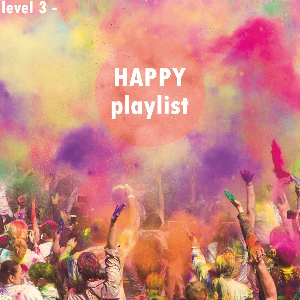

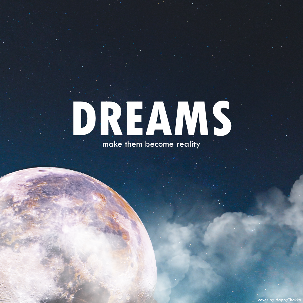
The general idea was to have an image which matches with the playlist name. The names of the playlists are added to the covers, since this is the standard for most playlists made by Spotify.
In the next section, I am going to show you how you can do this by yourself.
Tutorial
Requirements
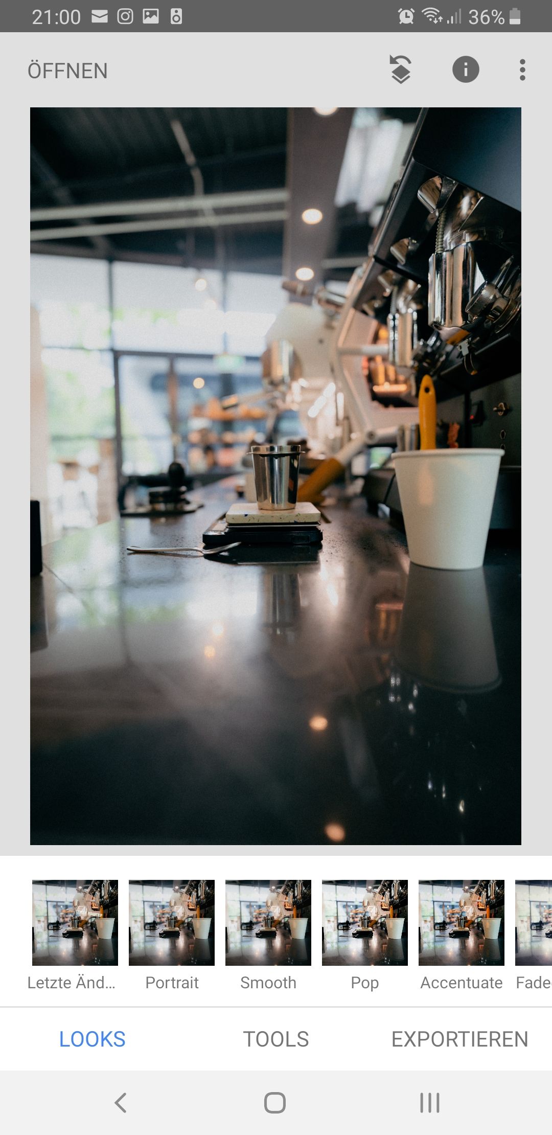
To do this yourself, you would need a photo editing program. I will show you one detailed advanced method with Affinity Photo (available for Windows and MacOS) and one (not-so-detailed) method with Snapseed (available for Android and iOS).
Affinity Photo Tutorial
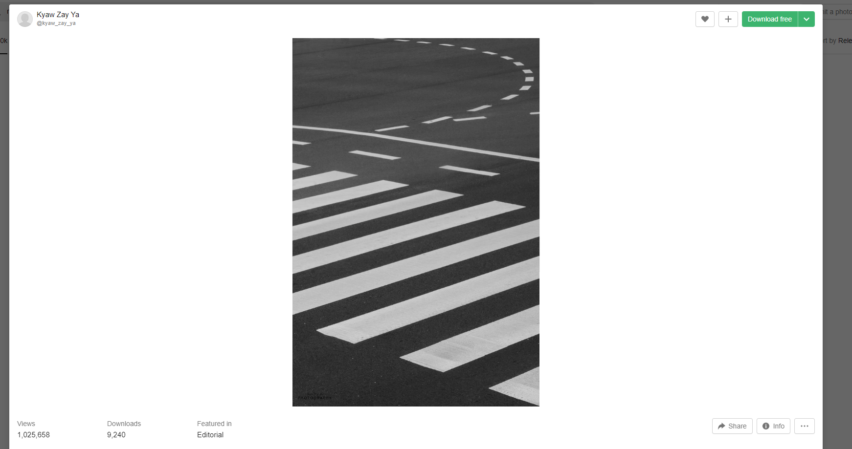
Get an appropriate stock photo.
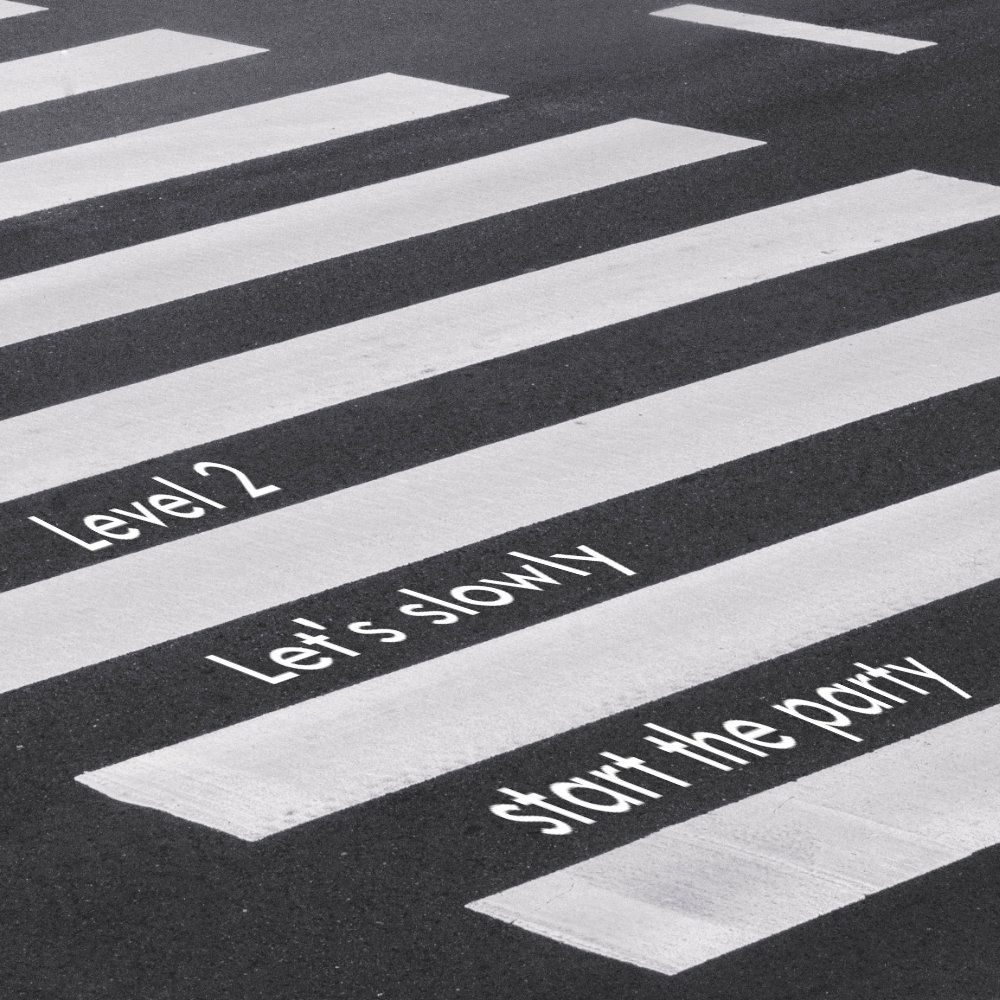
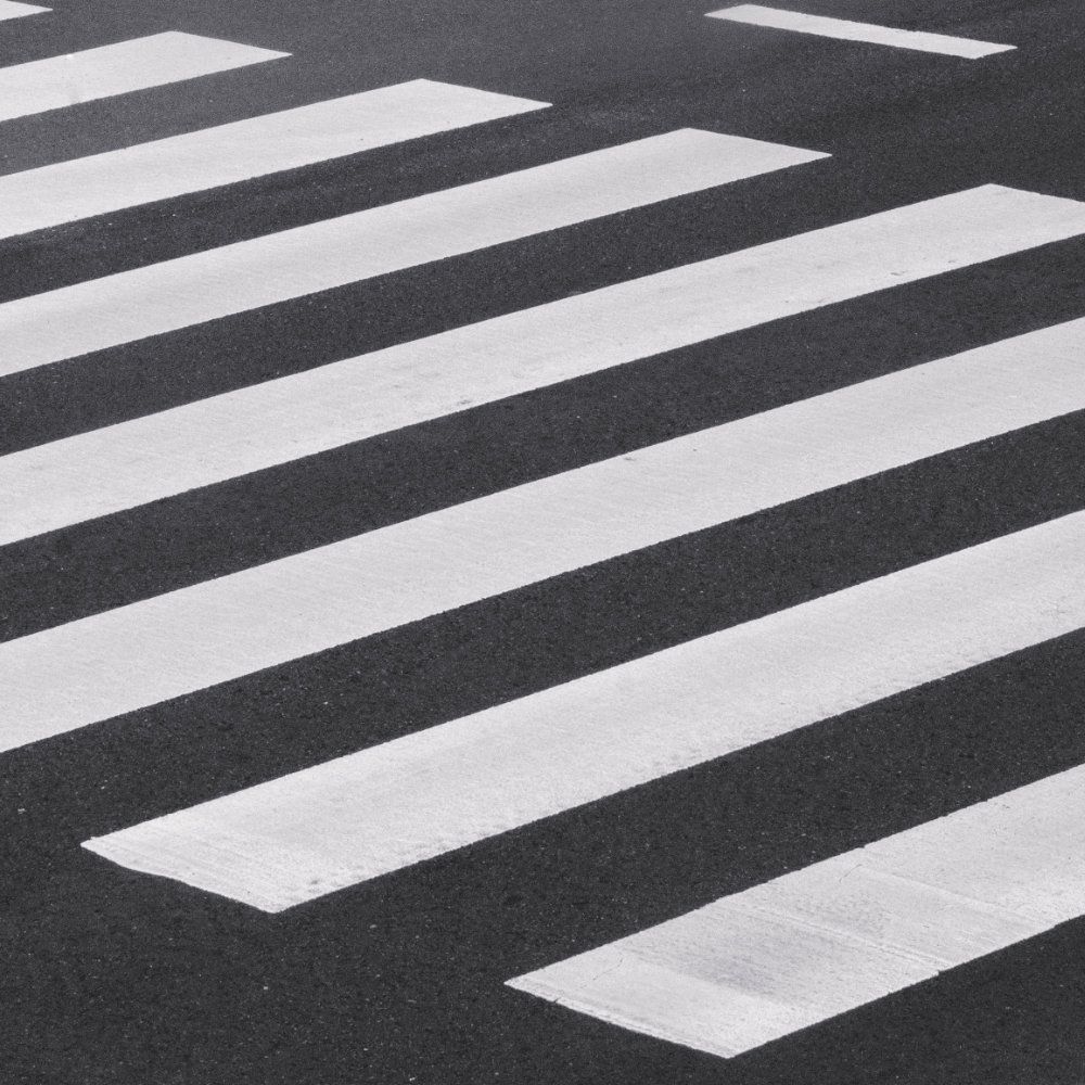
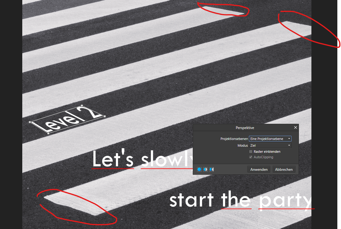
I am going to show you how I did my "Level 2 - Let's slowly start the party" picture. First, I had to find a main photo, which is going to represent my cover. For this, I used unsplash.com to get a free stock photo.
There, I looked for a picture, which resembles a road which can symbolize that I am walking on a road to get into my party mode.
Edit the picture
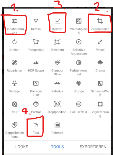
After downloading the picture, I opened it in Affinity Photo and cut it into 1000px x 1000px. Here, you have the freedom in choosing, which part of the picture you want to show.
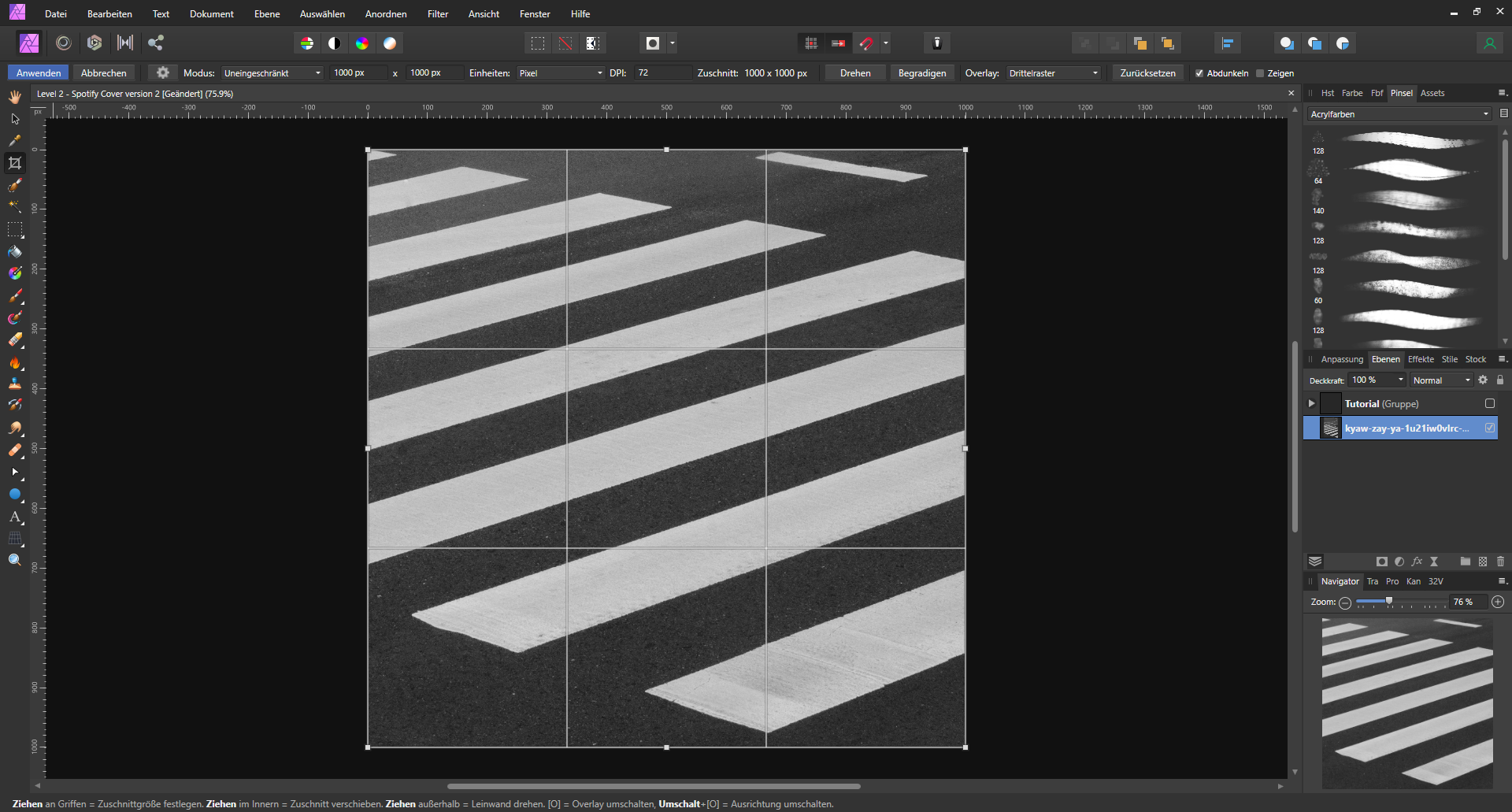
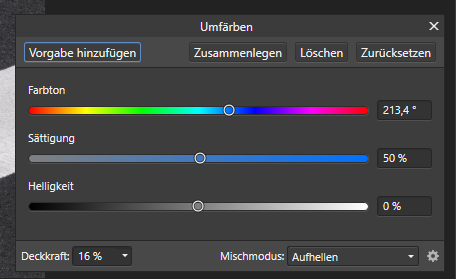
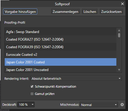
In the next two steps, I adjusted the colour slightly so that the picture feels softer. I used the recolor feature, to give the picture a more blueish colour.
When you should have troubles deciding for which color to go for, you can use color psychology to find the best suited color for you. You can read more about it on colorpsychology.org.
After adjusting the color, I wanted to make my picture softer. You can achieve this by making your picture brighter, reducing the saturation and the black and white part slightly. In Affinity Photo, you can also use the Softproof filter instead to simulate old camera color styles, which also can make the photos softer.

Add the text
Now, it's time to add the text with the text tool. You can use whatever font you like. I used Tw Cen MT. Pro-tip: you can use font-psychology to elevate your cover-picture. I would recommend you to only research about it when you are unsure which font to take, since the researching part can be exhausting. Sometimes, it's also okay to just listen to your gut-feeling. Nevertheless, here is a link to an article about font-psychology.
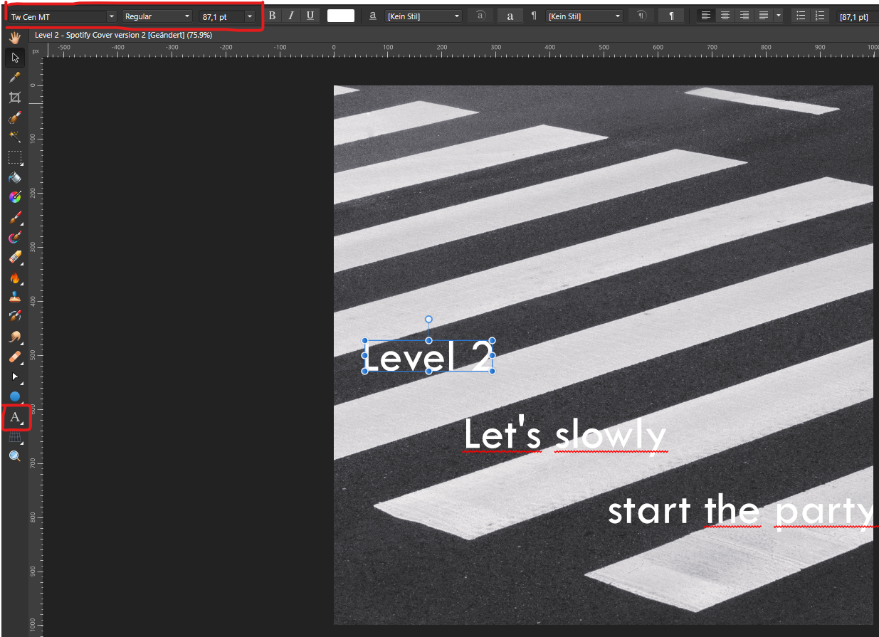
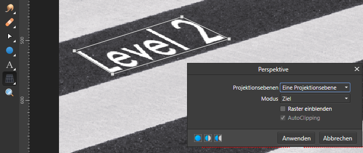
To make it look like as if the letters are part of the street, we have to warp the letters. For this, we can use the perspective-tool to align the edges of the letters with the road direction.
After aligning all text-elements, the picture is finished.
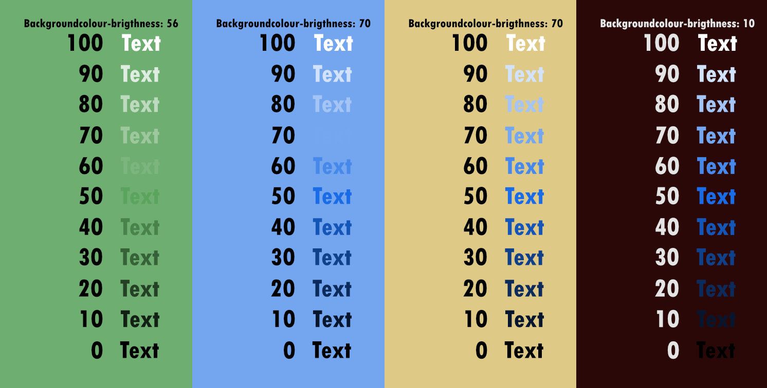
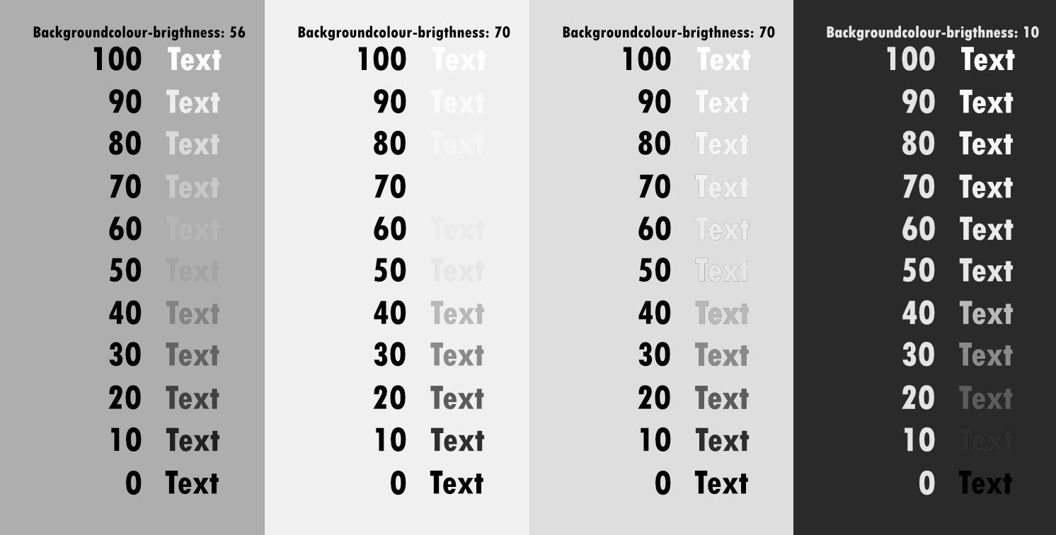
When adding text to a picture, make sure that the text-colour and the background-colour have a notable contrast. Even if you use different colors, the brightness-contrast makes it easier to read the text.
This is the final cover picture:

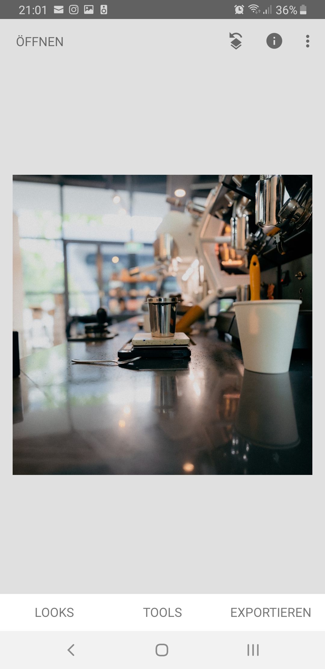
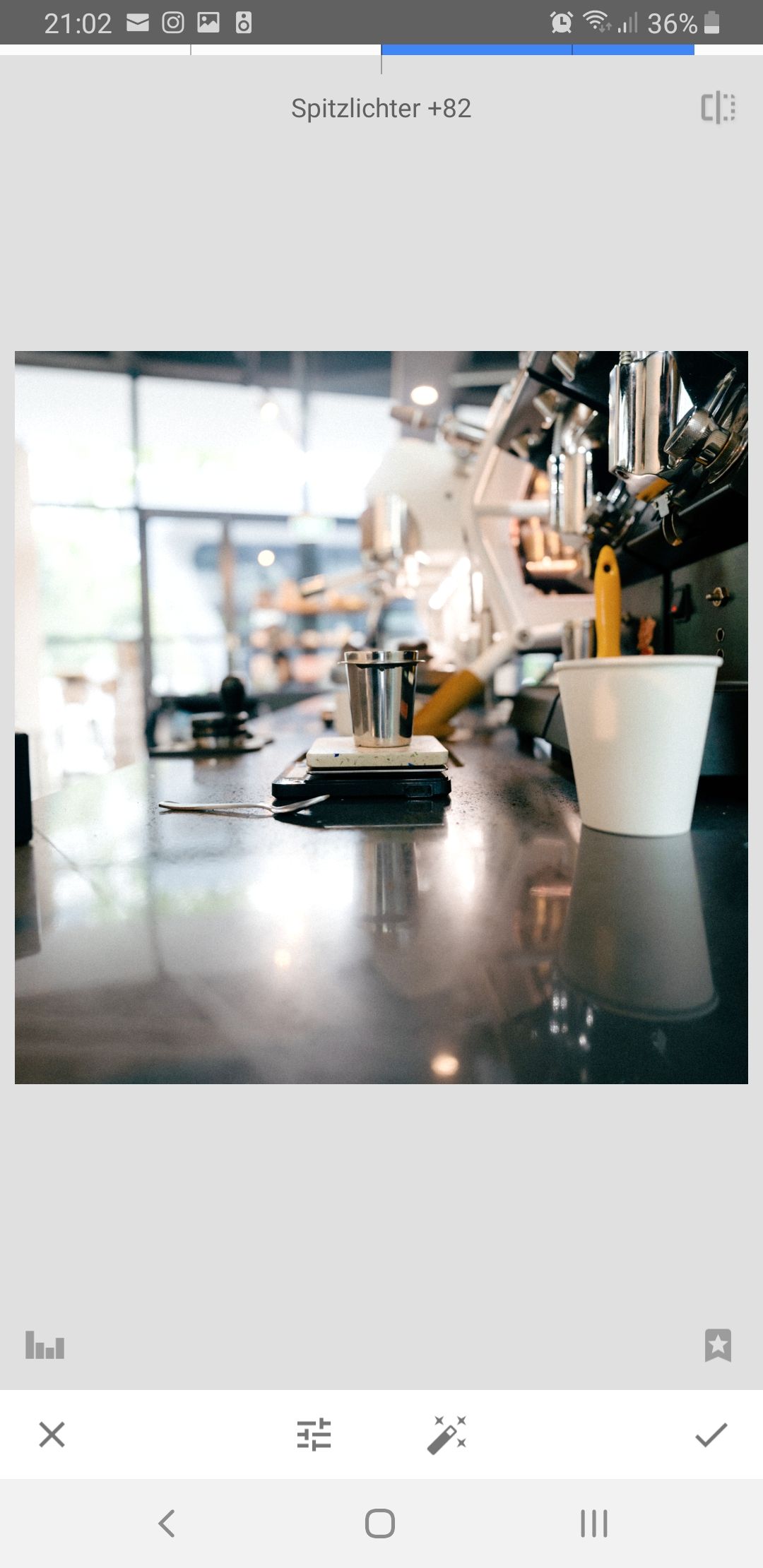
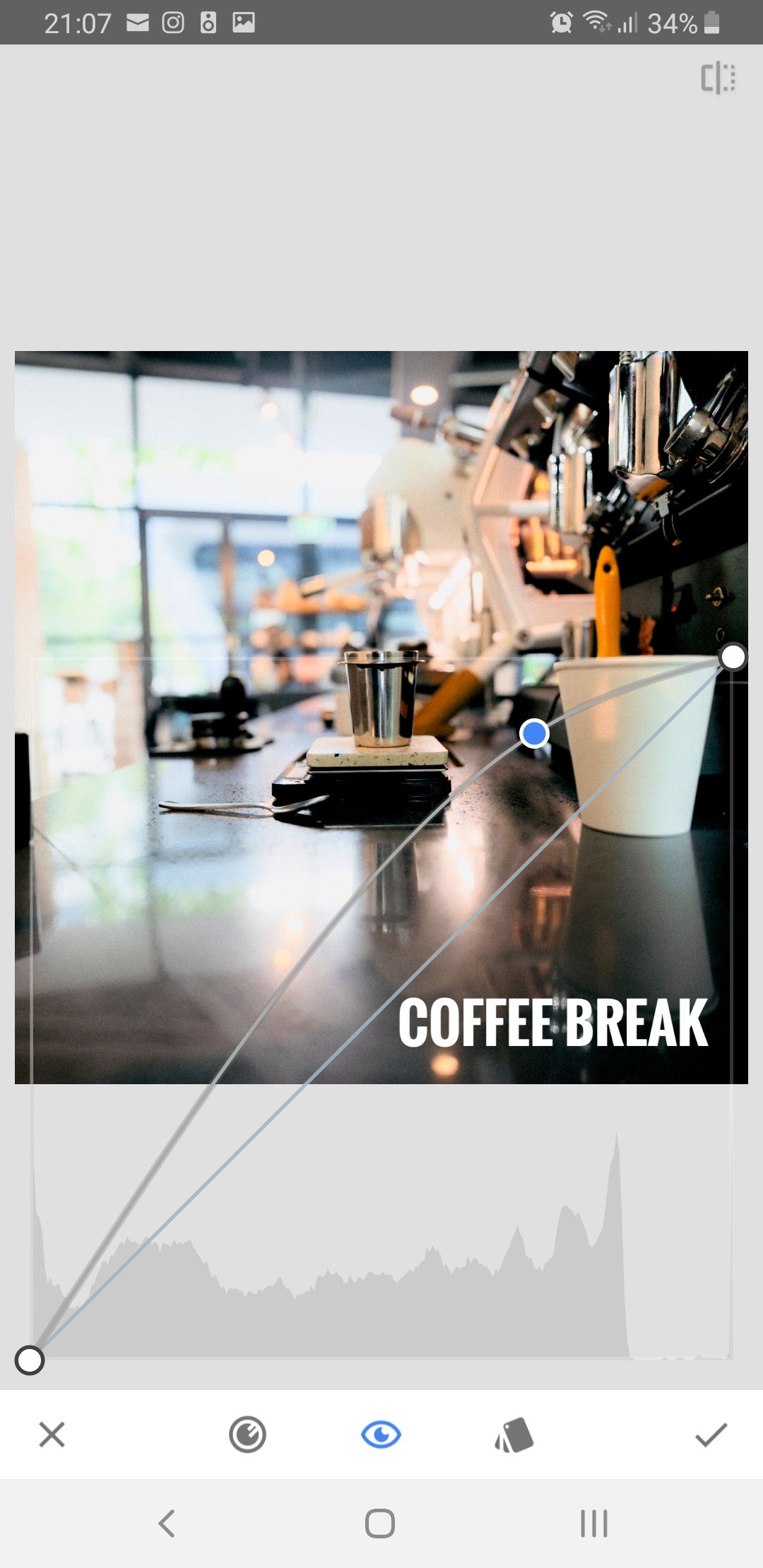
Snapseed Tutorial
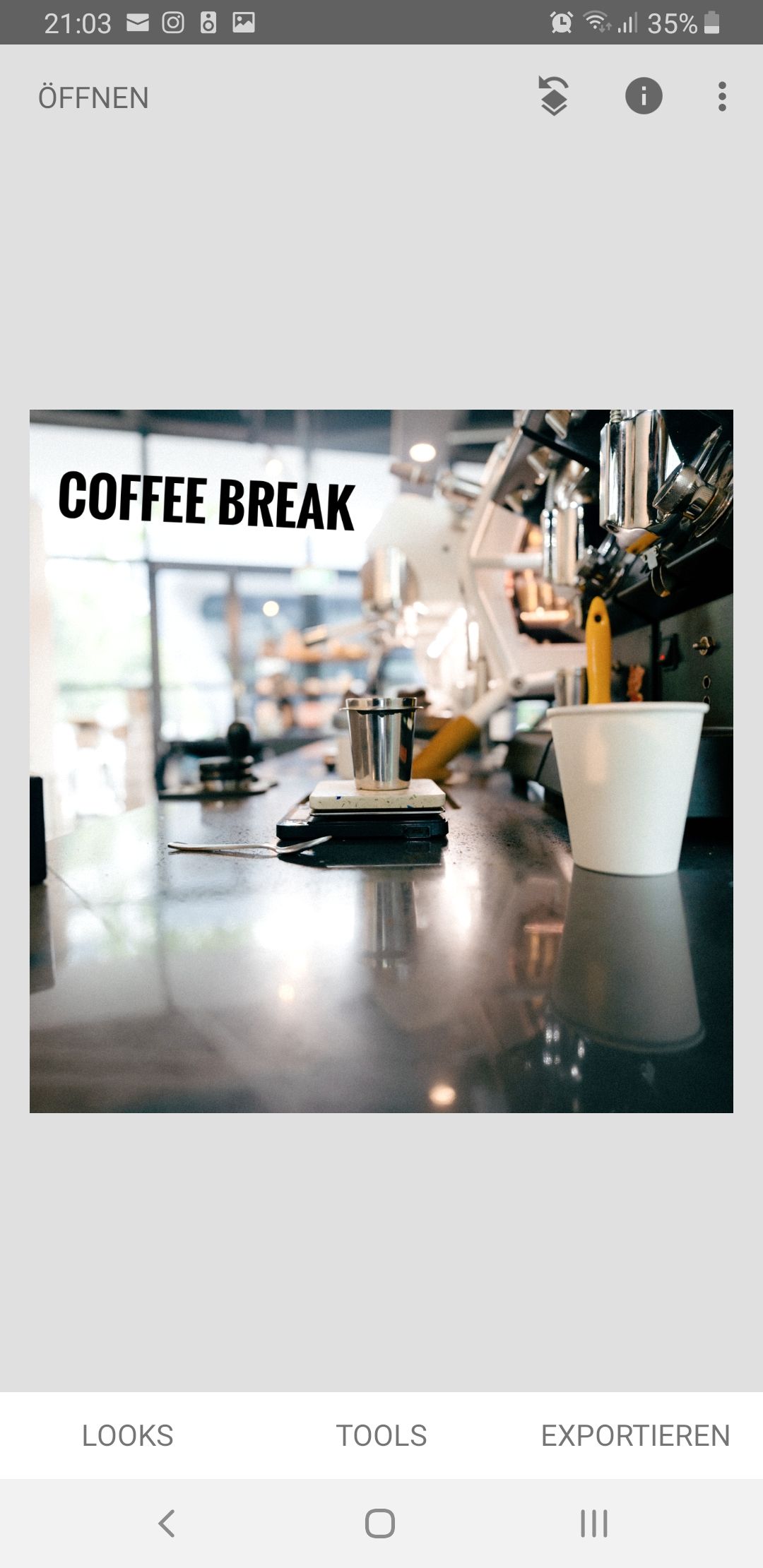
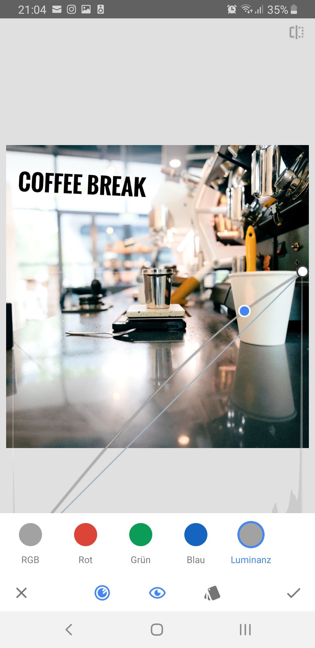
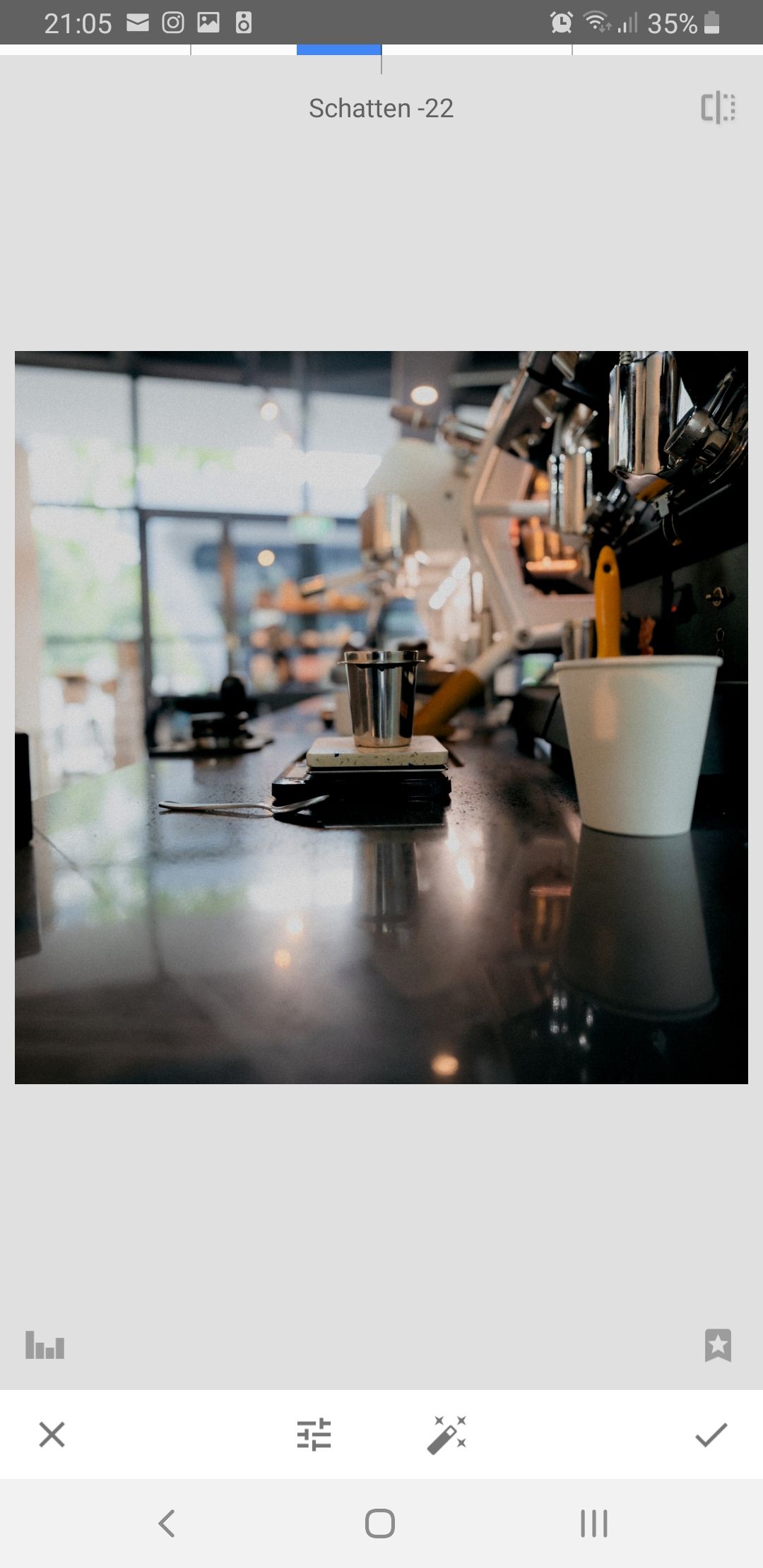
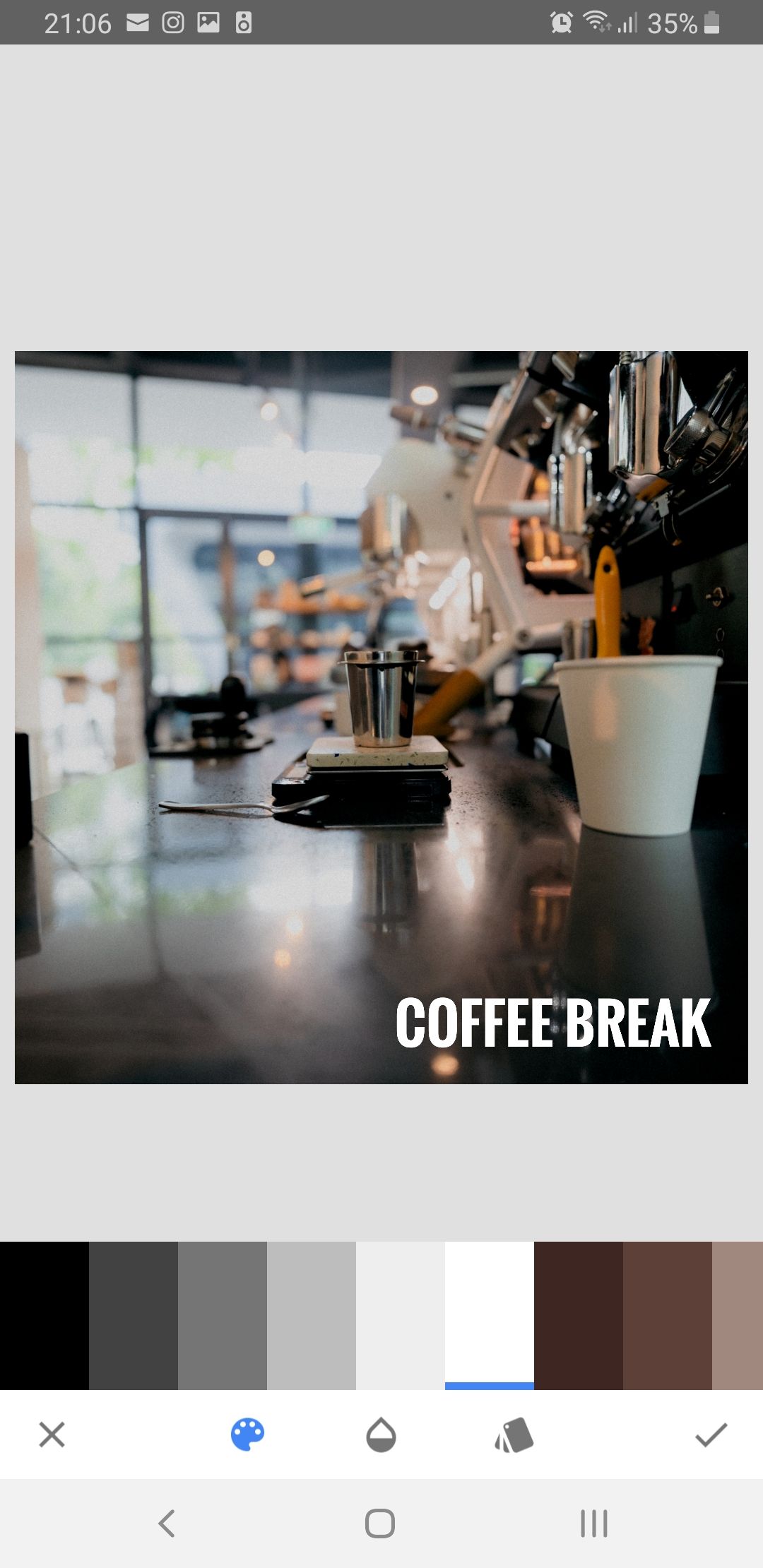
- Find a picture you like on unsplash.com
- Open the picture with Snapseed
- Look at the pictures below to see what I did. They are uploaded in the correct order from left to right. I believe the pictures are clear enough for you to follow this tutorial. If not, feel free to contact me.
Since this post is about Spotify Covers, I want to show you one of my Spotify playlists with one of my custom covers. These are my top 30 all-time favorites. The list is getting updated daily through another app. The songs are sorted after listening time in an descending order. Feel free to check it out. (/≧▽≦)/